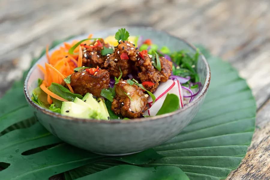
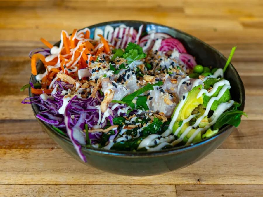
Katsu glazed chicken
GFDF
Kahakai Poké Bowls
A mobile-first food-truck website and original video connecting online discovery with fresh food and a real place to visit.
A food-truck website has only a few seconds to answer what is available, whether it suits the customer and how to order.
The experience brings those answers forward, then gives a large menu a clear structure that works just as comfortably on a phone.
Original video for Kahakai
I created this video for Kahakai and added it to their homepage. It introduces Liardet Street Projects, helping customers see where to find the food truck and what to expect when they visit.
Alongside the menu, ordering links and location details, the video makes the setting part of the customer journey. Original content and website design work together to introduce the business before a customer arrives.
Mobile conversion flow
Use the controls to see how the page supports discovery, choice and ordering.
The opening screen explains the food, confirms dietary options and keeps three useful actions within reach.
Gluten-free, dairy-free and plant-based choices.
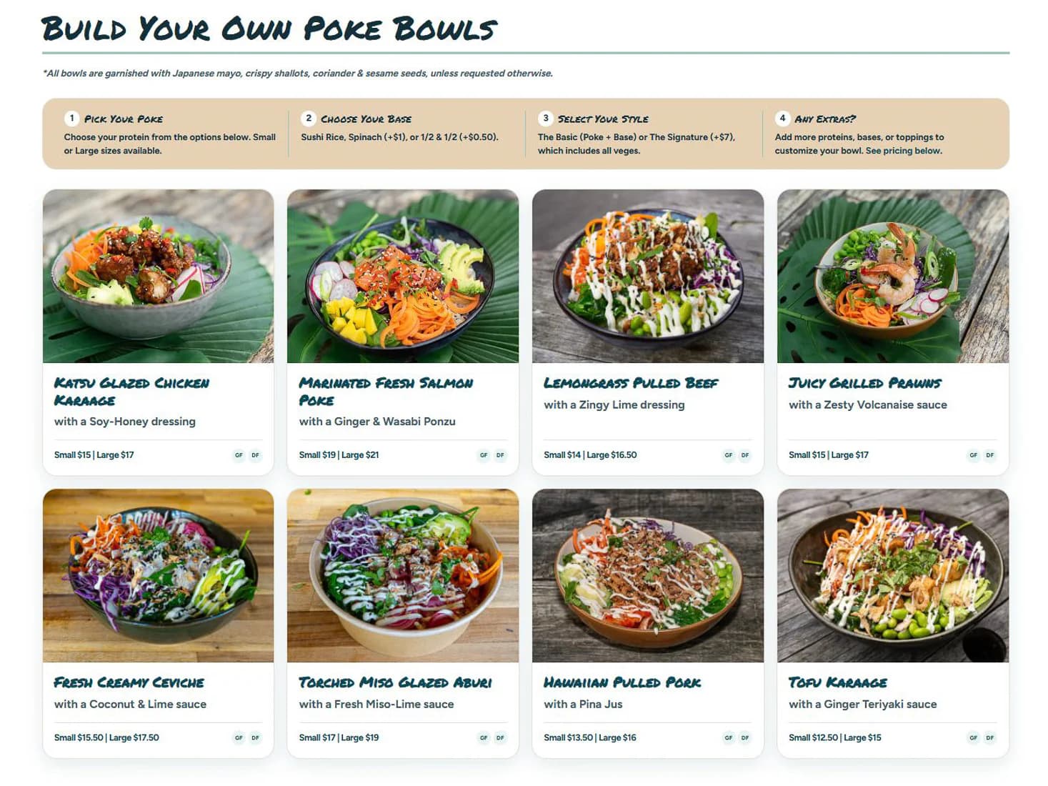
Instead of dropping visitors into a long product grid, the page first explains the sequence behind every custom order.
Start with the main flavour and protein.
Make the bowl suit appetite and preference.
Clarify the finishing flavour combination.
Complete the order without adding clutter.
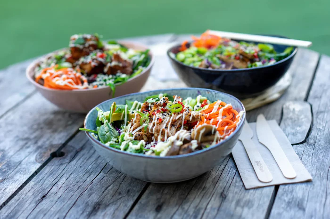
Hours, contact details, the map and directions sit together so local intent can become a visit without another search.
See the live location pageThe menu resolves to a comfortable single column with no horizontal overflow and generous touch targets.
Category headings, dietary markers and the bowl-building sequence turn a broad menu into manageable decisions.
Menu, pickup, delivery and directions stay available at the moments customers are ready to use them.
Let us map the decisions your customers need to make and build the shortest useful path through them.
Book a free session